Slider options
v0.0.0
This page shows examples of all available options for the basic slider.
Basic Options #
The following options are available via data-attributes:
data-slider-pagination[true*|false] show or hide pagination.data-slider-effect[slide*|fade] sets the transition effect between slides.data-slider-loop[true*|false] enables or disables the loop mode.
* default settings

Photo by Tracy Thomason
Photo by Tracy Thomason
© 2017 House of Clip Art
<!-- Slider  -->
<div class="vi-slider" data-slider-effect="fade" data-slider-loop="loop" data-slider-pagination="true">...</div>
Autoplay #
data-slider-autoplay[milliseconds] when set, starts autoplay of slides.data-slider-direction[rtl*|ltr] sets the slide-direction of the autoplay.
* default settings
Image courtesy of the Library of Congress
Photo by Tracy Thomason
Image courtesy of the Library of Congress
<!-- Slider  -->
<div class="vi-slider" data-slider-autoplay="5000" data-slider-direction="ltr">...</div>
Autoplay with Pause/Play button #
When pause/play controls are needed, add the extra elements to the footer.
The elements with class .vi-slider__control in the markup.
Image courtesy of the Library of Congress
Photo by Tracy Thomason
© 2017 House of Clip Art
<!-- Slider  -->
<div class="vi-slider" data-slider-autoplay="5000">
  <div class="vi-slider__slides">...</div>
  <div class="vi-slider__footer">
    <div class="vi-slider__pagination">
      <!-- paginatinon will be rendered here -->
    </div>
    <div class="vi-slider__controls">
      <div class="vi-slider__control vi-slider__control--hidden vi-slider__control--pause">
        <!-- Button type: slider  -->
        <button type="button" class="vi-btn-slider vi-btn-slider--pause vi-btn"><span class="vi-btn-slider__label vi-btn-slider__label--pause vi-btn__label">Pause</span></button>
      </div>
      <div class="vi-slider__control vi-slider__control--hidden vi-slider__control--play">
        <!-- Button type: slider  -->
        <button type="button" class="vi-btn-slider vi-btn-slider--play vi-btn"><span class="vi-btn-slider__label vi-btn-slider__label--play vi-btn__label">Play</span></button>
      </div>
      <div class="vi-slider__navigation vi-slider__navigation--prev">
        <!-- Button type: pagination  -->
        <button type="button" class="vi-btn-pagination vi-btn-pagination--prev vi-btn-pagination--inversed vi-btn"><span class="vi-btn-pagination__label vi-btn-pagination__label--prev vi-btn-pagination__label--inversed vi-btn__label">Previous</span></button>
      </div>
      <div class="vi-slider__navigation vi-slider__navigation--next">
        <!-- Button type: pagination  -->
        <button type="button" class="vi-btn-pagination vi-btn-pagination--next vi-btn-pagination--inversed vi-btn"><span class="vi-btn-pagination__label vi-btn-pagination__label--next vi-btn-pagination__label--inversed vi-btn__label">Next</span></button>
      </div>
    </div>
  </div>
</div>
Autoheight #
data-slider-autoheight[true|false*] enables or disables the auto height mode.
Though this is not advisable to use (think about the content below the slider).
* default settings
Photo by Tracy Thomason
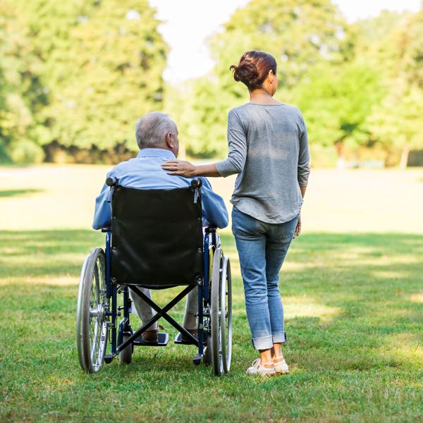
Photo by Tracy Thomason
Image courtesy of the Library of Congress
<!-- Slider  -->
<div class="vi-slider" data-slider-autoheight="true">...</div>
Stylesheets #
The following stylesheets are required to display this component.
The following additional stylesheet is used to display the example(s).
JavaScript #
The following javascript is required to display this component.
The following additional javascript is used to display the example(s).
Usage documentation #
Usage documentation can be found here.
Changelog #
Changelog
Fix
- 26 Mar 2025 - feat(slider): add
data-slider-loop to card preset.
- 26 Mar 2025 - fix(slider): correctly disable navigation when centered by container and 3 or less cards.
- 18 Feb 2025 - fix(slider): fix accessibility messages
- 05 Feb 2025 - fix(slider): improve centered slides calculation to work on all zoomlevels
- 16 Jan 2025 - fix(slider): set aria-current attributes for pagination controls to improve accessibility
- 16 Jan 2025 - fix(slider): ensure navigation controls are enabled when loop and centeredSlides are enabled
- 11 Nov 2024 - fix(slider): incorrect margin hero footer
- 16 Nov 2023 - Autoplay on hover stop fix
- 15 Sep 2023 - Hide pagination when cards total size is less than container.
- 01 Mar 2023 - Glitch in crossfade when controlled via pagination.
- hero footer position.
- Workaround browser pixel rounding issues.
- Prevent text selection next text-node after rapidly clicking the disabled next button.
- Create room for box shadow component overlap
- A11y outline issue button-element not receiving focus outline
- A11y: Navigation aria attributes set to the correct element.
- Pause/Play buttons not reflecting pause state. (js only)
- Positioning Controls Slider with video buttons.
- A11y slide containing element with keyboard focus scrolled into view.
- Hero preset documentation.
Changed
- Small change to allow usages outside
.vi-container on Full Width Page Layout
- Disabled forced load of images.
- A11y: Optimised tab-behaviour card preset.
- A11y: Navigation buttons are buttons now.
- Ability to detect video mode. (js only)
- Add ‘next slide’ as argument to slide ‘change’ event.
- Pause autoplay when playing video in slider.
- Accessibility: Apply ‘the’ focus outline on pagination (css)
- Use Rectangular Image –custom in basic slider examples to prevent incorrect use.
- Added
.vi-slider__slides element as root of slider. Not using this element will be frowned upon.
- Deprecated
.vi-slider__navigation-card, .vi-slider__navigation-card--prev and .vi-slider__navigation-card--next. Use .vi-slider__navigation, .vi-slider__navigation--prev and .vi-slider__navigation--next instead.
Added
- 23 Nov 2023 - Added inactivity start for slider when used does not interact with it.
- 09 Nov 2022 - `.vi-slider__footer–centered modifier. (awaiting use case for documentation)
- 25 Oct 2022 - Example of Centered Card Preset
- PBS support
- Optional Pause/Play button. Also example of Hero with Pause/Play button.
- RTL support
- Hero preset.
- Basic Slider video example
- Basic Slider and documentation
- Initial draft